Adaptive vs. Responsive Design

From the giant corporate monitor to the smartwatch, there are a huge number of ways that users can access information online today. Designers looking to bridge the gap between devices have two options for their designs: the adaptive site or the responsive site.
Responsive Design
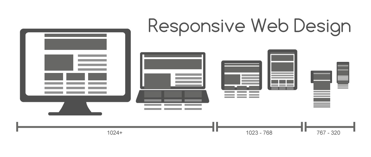
A responsive website shows content based on the available browser space. If you open a responsive site on the desktop and then change the size of the browser window, the content will move dynamically to arrange itself (at least in theory) optimally for the browser window. On mobile phones, this process is automatic; the site checks for the available space and then presents itself in the ideal arrangement.
Adaptive Web Design
Where responsive design relies on changing the design pattern to fit the real estate available to it, adaptive design has multiple fixed layout sizes. When the site detects the available space, it selects the layout most appropriate for the screen. So, when you open a browser on the desktop, the site chooses the best layout for that desktop screen; resizing the browser has no impact on the design. In adaptive design, it’s normal to develop six designs for the six most common screen widths; 320, 480, 760, 960, 1200, and 1600 pixels.
Standalone Mobile Design
There is also the option to create a mobile-only website.With no particular incentive to do this, the mobile-only design has fallen out of favor in recent times. It seems unlikely that it will make a comeback anytime soon.
Choosing Between Responsive and Adaptive Design
Responsive Design lets designers show content based on the browser space available. This allows consistency between what a site shows on a desktop and what it shows on a handheld device. Responsive design is the “traditional” option and remains the more popular approach to date.
Pros
- • Uniform & seamless = good UX.
- • Abundance of templates to use.
- • SEO friendly.
- • Often easier to implement
Cons
- • Less screen size design control.
- • Elements can move around
- • Advertisements lost on screen.
- • Longer mobile download times.
Adaptive Design, developed in 2011, is more involved in that the designer has several fixed layout sizes. It offers an alternative to the “one-size-stretches-to-all” approach.
Pros
- • Allows designers to build the best UX for the appropriate device.
- • Mobile devices can sense their user’s environment.
- • Designers can optimize advertisements based on user data from smart devices.
Cons
- • Labor-intensive to create – most adaptive designs are retrofitting traditional sites to make them more accessible.
- • Tablets and netbooks can have trouble with site configuration tending to be smartphone- or desktop-oriented.
- • Challenging to SEO — Search engines have trouble appreciating identical content on multiple sites.
Choosing between a responsive and an adaptive design takes careful consideration. While it might be prudent to stick to a responsive design for the sake of expedience (saving cost, improving SEO, and keeping users content with a seamless experience between devices), it’s crucial to check the pros and cons of both designs in full. Adaptive design can tune in more to users’ varying needs in the field; thus, it’s vital to keep a finger on the pulse of change.
Always with WebFlow.gr